By: Jon Tennent | jtennent@deandortonstg.wpenginepowered.com
The U.S. Treasury Department recently unveiled a website that provides data and helpful visualization tools to make information about Federal income and spending transparent and accessible to the public. The Finance Guide section in particular might be of interest to you.
While we encourage you to visit the site and explore the information in depth, we have collated certain data below to highlight a few interesting statistics.
Glimpse #1
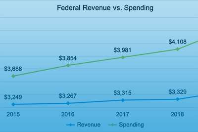
Although spending consistently outpaces receipts, the Federal government took in a record $3.5 trillion in 2019—more dollars through tax revenue than in any previous year. At $4.5 trillion, spending was also at a record high in 2019.
https://deandorton.com/wp-content/uploads/2020/02/Gov-Finance-Graph-3-1024×425.png
| Year | Revenue as a % of Spending |
|---|---|
| 2019 | 77.9% |
| 2018 | 81.0% |
| 2017 | 83.3% |
| 2016 | 84.8% |
| 2015 | 88.1% |
Glimpse #2
We grouped some of the major categories of federal spending in the graph below to present a high-level view of major outflows. “All Other” includes Education, Training, Employment, & Social Services; Transportation; Administration of Justice; International Affairs and Aid; Agriculture; National Resources & Environment; Science, Space, & Technology; Community & Regional Development; Commerce; Energy; and General.
https://deandorton.com/wp-content/uploads/2020/02/Gov-Finance-Graph-1-1024×429.png
Glimpse #3
The average family unit of 3.14 persons has remained relatively steady in the U.S. over the past few years, but outstanding U.S. debt per family unit has been steadily growing as a result of annual deficits.
https://deandorton.com/wp-content/uploads/2020/02/Gov-Finance-Graph-2-1024×435.png