Over the years, Intacct has continued to evolve the look-and-feel of their user interface. Effecting May 11th, Intacct is providing the users with a Beta release of the new and updated user interface (UI), called the “Intacct Action UI”. But the new UI is not just a new and pretty face you see when you start Intacct!
The first feature that is apparent is that you can toggle the new interface on and off clicking “Enable Beta UI”. If you don’t like the new look and feel, you can simply turn it off with one click! Previous versions required that you go into the User Preferences, change the settings, and refresh the browser. And because it is controlled on a user-by-user basis, users can elect when they are ready to start using the new interface. If you like the old interface and feel comfortable with it, you don’t have to use the new interface right now.
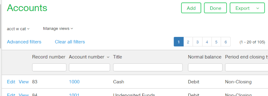
Once you starting using the Action UI, one of the first things you’ll notice is that the interface is more open and readable so that your eyes can more easily read the screen and move around the menus. The colors and fonts have been adjusted to make the screens easier to read.
Here are some new features to check out!
- Action buttons are now consistently located at the top each screen so that you can easily add a new record or post a document without having to scroll down to the bottom of the screen!

- For multi-entity users, switching companies becomes much easier with a convenient Entity picklist on the right side of the screen for easy access.

- Customizable application bar now allows you to re-arrange the module listing with your mouse, rather than changing under User Preferences.
- Entity colors can be assigned to help identify which entity you are working in Expanded pop-up boxes during data entry users can now expand their view the dialog boxes, making it easier to enter data for instance when creating a new customer or vendor on the fly.
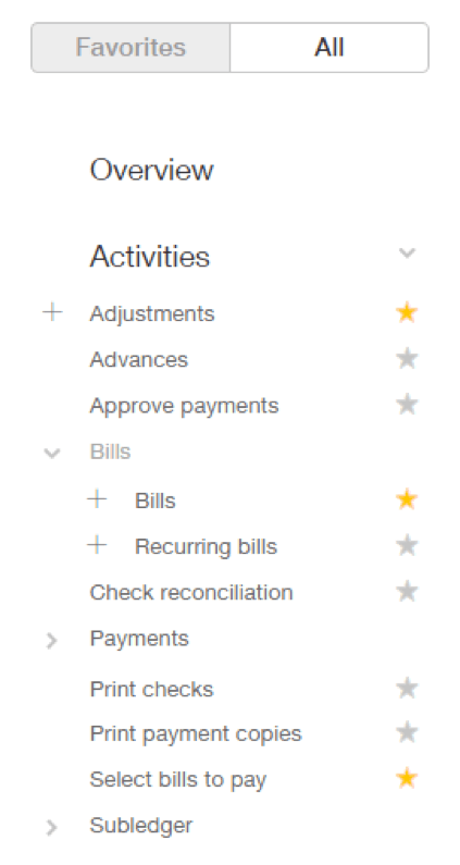
The new Action Navigation pane provides a new way to move around Intacct:
- A new “Action All” tab is now visible on the left side of all modules and allows users to pick from the “All actions” list and easily add items to the Favorites list. This allows users to set up their most frequently used screens in Favorites, saving time navigating to individual screens.

- Favorites selections can now be reorganized and sorted
- The “Action All” can be used to access all of the data entry screens, rather than navigate from the pulldown menus, speeding data entry.
- The Setup menus now include the building blocks for module setup such as vendor & customer records, Groups, and Types.
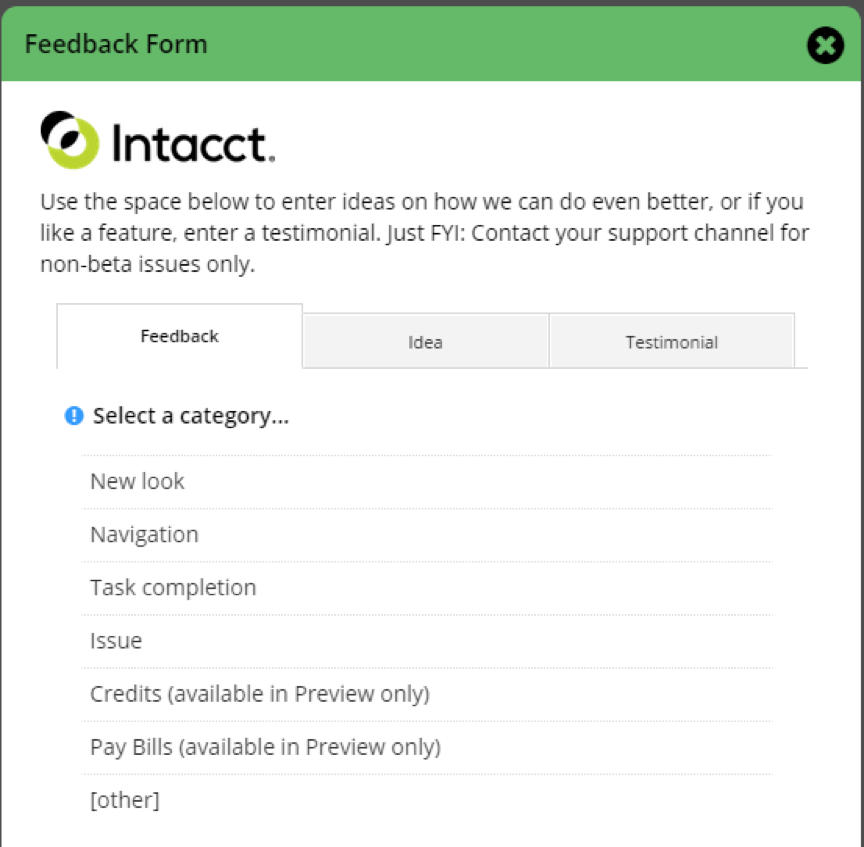
Probably the very best part of the new UI is the ability to provide Intacct with feedback and ideas for making the product even better. By clicking “Send us feedback” link adjacent to the UI Enable button, you can share your thoughts about the new UI with Intacct Development team, so that they can improve the UI based on user experience. Within the Feedback Form, users can provide feedback on the new interface, suggest ideas for improvement, or even provide a testimonial based on their experience.


